Color Space is an abstract board game, but that doesn’t mean it’s devoid of art. Every choice I made, every bit and bob, was in service to the theme of the game. In this design journal entry, I’ll explore how I decided on and designed the aesthetics of Color Space.
Abstract typically means minimal, not devoid
Since its conception, I wanted Color Space to feel like you were playing with vivid pigmants, painting the cosmos in a way. The game is a marriage of the wonder of space and the whimsy of finger painting, steered only by your raw creativity. When you play, if it feels like you’re simultaneously a magical god or hotshot pilot, and a wee child in gradeschool, I’ve accomplished my goal.
That’s why, when selecting pieces, I wanted the most vibrant display of colors possible. I knew that even though the game was space themed, and we often think of ship metal when envisioning our prescence in space, I wanted wooden pieces.
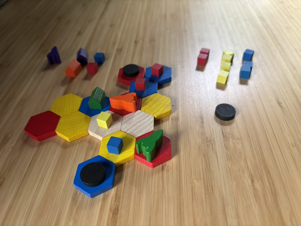
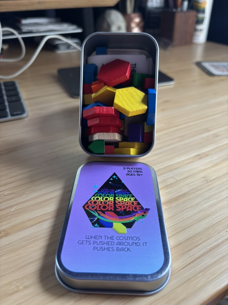
And obviously, I also wanted the game to be affordable, and metal pieces would’ve skyrocketed the cost of this lil 30 minute game. I did go for a mint tin as the box, however, to still bring some metal spaceship feel to the game.
Space is big, but Color Space is smol
I didn’t want this to be a large game, although it could’ve been. But I did want it to be as big as it could be while still fitting inside a mint tin. I love mint tins! I actually don’t own any mint tin games but now I’m on the hunt for a few games.
I designed the Color Space art myself and ordered these mint tins from The Game Crafter, which did a fantastically job beautifully printing my designs.
Inspired by science fiction
The tin art was all designed by me in Affinity Designer. My inspiration mostly came from Amazing Stories, a scifi magazine from the 30s; although I did take some inspiration from 70s Scifi book covers like Asimov’s Nightfall story collection.
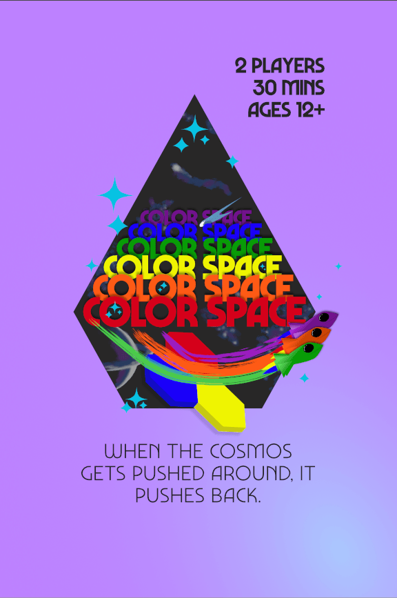
Here’s a little bit about what’s going on here:
- I fonts carry the design quite a bit. I purchased a commercial license for a font called Marvin Visions, which I’ve also used in the past for my book cover (Transfiguration). Visions as a typeface has a lot of fonts to offer with various weights and kerning, it’s quite versitile.
- The shapes are custom vectors that I designed, shapes filled in and overlayed with gradients to give some slight dimension while maintaining a minimal feel.
- Inside the black obelisk type of shape is a background of planets and commets and general space-y objects. I illustrated that in Procreate for iPad. My goal here was to give it an airbrushed, painterly feel, similar to scifi book covers from the 70s
Color Space is out in the world!
I’m writing this after completing work on Color Space and selling it at PAX West. After a year and a half of working on this game, I’d need to write a novel to express how I felt being able finally bring it to the board game community. I’ll soon write a Monthly Crust (and maybe a dedicated article) on how the endeavor went. Spoiler: It went well!
I’m still figuring out how to do the whole online store thing for folks who missed the chance to buy it at PAX. Stay tuned for that!

Leave a comment