Party games come with a tricky design space. There’s a fine line between too complex and too rudimentary, between too difficult and too easy. Party games seem effortless to set up and play, and that’s the design challenge right there: To create that environment for players. You want games that can be played with large groups of people, where there aren’t too many rules, where they don’t have to follow every exact movement of their allies or opponents to be sucessful when it’s their turn.
Graphic Design is My Passion is an 18-card party game, that’s the aim. I want you to be able to carry it around wherever you go and bust it out whenever you need. I’m still figuring out the exact player count limit and things like that, but so far it works well between 4-6 players.
I’ve had three playtest sessions between the first Design Journal entry and this one, with major changes the game for the second session. Allow me to break down these sessions. Buckle up, this is a long journal entry, baby!
Playtest Session One
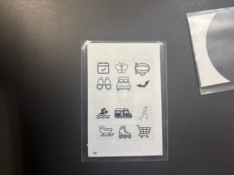
One person played as the “client” who chose an icon from a group of twelve, not telling anyone what the icon was. They also chose from two personality types, restricting their communication. This client specifically chose the ‘mime’ personality where they couldn’t speak, but had to mime the icon somehow. The client also chose binoculars, which as you can guess, worked quite well with the mime personality type.
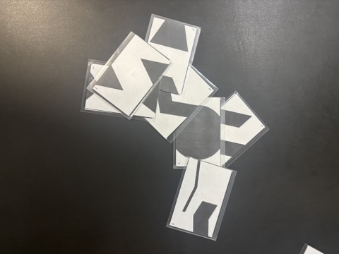
Everyone else played a graphic design intern, scrambling to make an icon for the client using a collage of abstract symbols on the card backs.
This is a cooperative game, so the interns had to eventually guess what it was they were designing.
There was fun to be had in this iteration, but it was ultimately too easy. The communication style of miming meant that the client only needed to hold up a pair of invisible binoculars for the interns to guess what it was and design around it. The game being easy isn’t that big of a deal to me. It’s a party game, meant for players with varying levels of board game experience and focus levels. But this was too easy, as in, everyone got it after the first piece of info was shared. Not good.
But there was another, bigger issue with the flow of the game. You didn’t have to design anything to guess the icon. Interns could solely rely on the mimed info to guess the right icon. There was a disconnect between my theme, main element of tension, and win condition.
One playtester suggested that the client should have a “brand” instead of a strict work, and they should describe what they want for their brand and the interns should design around that. As an idea, that seems intriguing, but to distill that down to a game atmosphere, especially a party game, how would it work? I’d probably have to shift the game from cooperative to competitive, where each intern tries to design their best logo. And then the game would likely devolve into more of a popularity contest, where players pick logos from the people they like versus what best matches the “brand.” Also, the idea of branding is amorphous, right? So if I said I wanted a strong logo to reflect my tough outdoor clothing brand, someone might design a lion, someone else might design a gorilla, but they’d all be built out of messy abstract shapes. And the client might just pick the one that looked closest to that of a lion or gorilla, not what reflected their brand. Finally, a competitive environment would discourage table talk between players, and I didn’t want that for a party game. But one of my early ideas for this game was that you were designing a logo for a brand, so maybe there was something to that…
People had fun designing the icon using the shapes, but it wasn’t important to actually playing the game. The playtesters suggested that I invent a third role that has no information.
But I didn’t want to do that.
Playtest Session Two
I decided to turn the game on its head a bit, slightly changing the story of gameplay. Instead of a client, one person played the role of a senior manager. Interns would pick an icon to design from a group of six, then work together to make an icon. The manager had to guess what the icon was from the list. Again, fully cooperative, so everyone had to work together to make an icon that made sense, and the senior had to guess it.
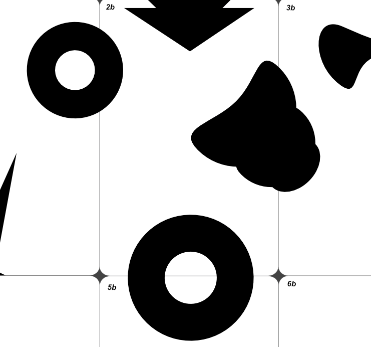
I got rid of the “personality types” bit and just focused on the icons. I also changed the shapes! Instead of abstract forms, they were simple shapes like triangles and circles.
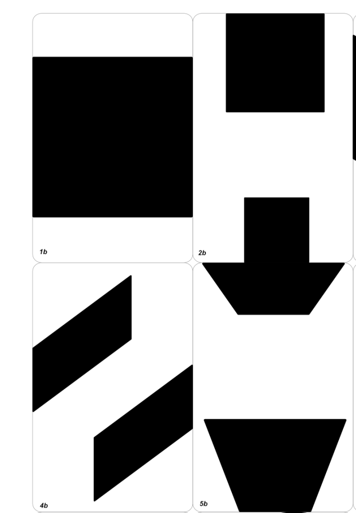
There were a lot of wins here, this game was moving in the right direction. For one, the basic shapes gave players more opportunities for use. It’s easier to know how to place a bunch of quadrilaterals and ellipses, much more difficult to place a blob that kinda looks like a turd. (Unless the thing you’re designing is a turd.)
There was also a lot of fun, encouraging table talk, and more of a fun experience overall. But, guessing the logo was still too easy! The senior manager could pick the logo being designed from the group with ease. Not only because the interns picked the easiest icon to design, but because their table talk was accidentally spoilery, revealing enough info accidentally for the manager to guess the design.
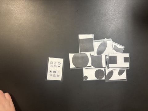
Playtesters also found that just having a pile of cards to work from was overwhelming and made the game more haphazard in an unfun way.
Still, progress.
Playtest Session Three
This one was interesting, I actually decided to try a bunch of stuff that I suspected wouldn’t work well, but I needed to be sure. I haven’t designed a party game before, so I’m still figuring out what constitutes as fun in such an environment. I’ve, of course, played party games before, so I can suspect what might be fun. But I’ve also played a lot of duds, party game wise, and I’m trying to avoid those pitfalls by giving this game the brute force iteration it deserves. This is mainly for me to figure out the design space I should be working within for Graphic Design is My Passion.
Even still, I figured out some interesting ideas to shape this game’s future.
We played two different variants of the game during this session. One where everyone worked together to make a single design, like normal, and another where everyone made their own version of the design. Instead of getting to choose their design, I came up with a card draw mechanic with a lettered and numbered grid that randomly chose the design for them. Don’t worry too much about the details of how that works, the important part is that interns could no longer choose the graphic they were designing.
We also played through a new mechanic based on playtester feedback, one that I suspected would work. Instead of just having a pile of cards to deal with, each player drew two cards
We tried a few other mechanics, a few blank cards to cover undesirable shapes, making personality traits a “per turn” element that rotated, and developing questions for the senior manager to ask at the end of the round. Much to my lack of surprise, none of those mechanics really worked! I tried those things mainly based on prior playtester feedback, and I had a feeling it wouldn’t be the spark that the game needed to shine, but I’d also be kicking myself if I didn’t try those things just to rule them out.
A bit more on the blank cards, they actually worked a little better when interns were designing one graphic, but not when they were designing their own piece.
What stood out to me was that everyone enjoyed making their own design versus everyone working together to make one design.
One playtester suggested that we take conversational rules from another game to avoid spoiling the icon: every player can only converse around some variation of “yes” or “no” during play. This seemed to work well, so that rule’s likely to stick.
Another goal here is to get the senior manager more involved, so we tried a version where they hand the cards out to interns, and interns pick which card they want to keep.
The biggest issue this version of the game faces is that players feel like there’s no creativity. They’re told to design an icon and they design it. Not much room for human interpretation and therefore, not much decision making on their end. I have some ideas for how to fix this…
The next iteration
Okay, hear me out: What if the senior manager is the only one who knows what the design is, like in the first iteration, they also are the one who hands out the cards, so interns have to try and glean the information based one what card the senior designer gives each of them. They also get to look at which cards the senior discards to gain insight. I’m going to try two variants of this: one where they make their own design and one where they all make one design.
Another idea: I go back to the interns getting a word prompt, not visual graphic, and they each have to make their own interpretation of that thing, where the senior manager guesses it at the end. The senior still hands out the cards, just to give them more interaction. Language is still limited to variations of yes, no, or maybe.
I’ll have to develop two different card fronts, meaning two simultaneous versions of the game, and test those things out. This won’t be difficult to do, but it’ll pay off to know which version is more fun for people.
Thanks for sticking it out through this long design journal. I’m excited to test out more variants of Graphic Design is My Passion. I have to build them first, so on that note: Until next time!

Leave a comment